
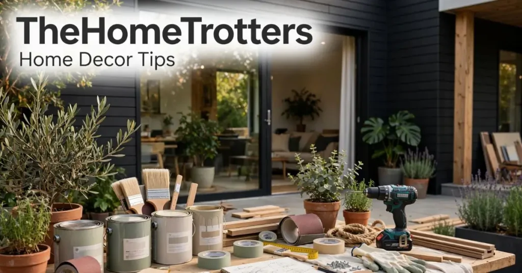
Introduction
Decorating a home well is less about having good taste and more about understanding which decisions produce which results. Most homeowners who feel stuck with their home decoration are not suffering from poor judgment. They are making individual decoration decisions without a framework connecting them, and the results feel disconnected because they are.
TheHomeTrotters home decor tips approach this differently. Rather than presenting decoration as a series of product recommendations, the platform builds decoration guidance around principles. Understanding why a choice works makes it adaptable to any home, any style, and any budget rather than requiring exact replication of a specific room image.
This guide covers the decoration principles that TheHomeTrotters identifies most consistently as high-impact, how to apply each one across different spaces, and what seasonal decoration thinking adds to the overall picture of a well-maintained home.
What Are TheHomeTrotters Home Decor Tips?
TheHomeTrotters home decor tips refer to the decoration guidance published through TheHomeTrotters platform covering practical principles of interior styling, furniture arrangement, color use, accessory placement, and seasonal decoration for residential spaces. Unlike purely aspirational decoration content, the platform’s tips connect decoration choices to the underlying reasons they improve spaces, making the guidance adaptable to different home sizes, styles, budgets, and aesthetic preferences rather than prescriptive about specific products or exact visual outcomes.
Quick Summary
TheHomeTrotters home decor tips are built around decoration principles rather than product lists. The core principles covered here include color relationships, the rule of three, furniture proportion, negative space, and seasonal refresh thinking. Each principle is explained with specific application guidance and honest cost context for US homeowners.
Decoration Principle One: Color Creates Relationships, Not Just Atmosphere
Most decoration content treats color as primarily an atmosphere tool. Warm colors feel cozy. Cool colors feel calm. Blue bedrooms promote sleep. These observations are real but incomplete. The more useful decoration principle is that color creates relationships between elements in a room.
The 60-30-10 color relationship
TheHomeTrotters home decor tips frequently reference the 60-30-10 color distribution as a framework for creating visual coherence in any room. Sixty percent of the room’s visual field in a dominant color, typically the wall and large furniture. Thirty percent in a secondary color, typically smaller furniture, rugs, and window treatments. Ten percent in an accent color, typically accessories, plants, and decorative objects.
This distribution creates coherence because it prevents the visual competition that arises when colors appear in roughly equal proportions. A room where walls are gray, sofa is navy, and accents are terracotta feels resolved because each color has a defined role. The same three colors in roughly equal amounts feel chaotic because none leads.
Undertones as the hidden relationship driver
Colors that read as neutrals, white, gray, beige, and cream, all have undertones that connect them to the warm or cool end of the spectrum. Walls painted in a cool gray do not harmonize with warm wood tones in the same way walls painted in a warm gray do, even though both appear gray in isolation.
TheHomeTrotters home decor tips emphasize this undertone awareness because it explains why rooms that look right in photos sometimes feel off in real life. The photography lighting masks undertone conflict that real lighting reveals. Testing paint samples on the actual wall in the actual room’s light, observed at different times of day, prevents this common color decision failure.
Decoration Principle Two: The Rule of Three Creates Visual Interest
Decoration elements grouped in odd numbers, particularly threes, look more natural and visually engaging than elements grouped in pairs or even numbers. This is not aesthetic theory without basis. It reflects how human visual processing naturally seeks pattern and movement.
Applying the rule in practice
Three candles of varying heights on a console table creates movement because the eye traces a path through the different levels. Two identical candles creates symmetry that reads as static. Four candles creates evenness that reads as arranged rather than considered.
The rule applies to throw pillows, which work better in three or five than in two or four. To plants grouped together, where three sizes creates more interest than two. To artwork clusters, where three frames at varied sizes creates a more dynamic gallery wall than two perfectly matched pieces.
The height variation component
TheHomeTrotters home decor tips on vignettes and grouped arrangements consistently add height variation to the rule of three. Three objects at the same height read as a row. Three objects at different heights read as a composition. A tall plant, a medium ceramic, and a low book or candle create a visual path that makes an arrangement feel deliberate.
This costs nothing when using existing objects. It simply requires arrangement with height variation as a deliberate goal rather than placing objects side by side at whatever height they naturally occupy.
Decoration Principle Three: Proportion Determines Whether Rooms Feel Right
The most common reason a well-decorated room still feels somehow wrong is proportion mismatch. Objects, furniture, and decorative elements that are incorrectly scaled to each other or to the room create visual tension that is felt before its cause is identified.
Furniture proportion relative to the room
A sofa that seats two in a living room designed for five makes the room feel empty. A dining table that seats eight in a dining room with twelve-foot ceilings makes the ceiling feel oppressive rather than grand. Getting proportion right requires measuring before purchasing rather than estimating from showroom impressions.
TheHomeTrotters home decor tips on furniture proportion consistently recommend drawing a basic room floor plan with measurements before shopping for any major furniture piece. Knowing that a sofa needs to be between 84 and 96 inches to fill a seating wall correctly eliminates the most common proportion mistakes before they happen.
Art proportion relative to the wall
Artwork hung on walls is almost universally too small in the homes of non-designers. A piece that looks substantial at a gallery scale often looks like a postage stamp on a residential wall. TheHomeTrotters home decor tips on art consistently recommend going larger than feels comfortable on the first instinct.
The guideline: the visual width of art or a gallery wall grouping should be approximately two-thirds to three-quarters of the furniture piece below it. Art centered above a six-foot sofa should be roughly four to four and a half feet wide to look proportionate rather than lost.
Decoration Principle Four: Negative Space Is an Active Decoration Tool
The spaces between objects in a room are not empty space waiting to be filled. They are an active decoration element that allows other elements to breathe, be seen clearly, and register as intentional rather than crowded.
The decluttering principle applied to decoration
TheHomeTrotters home decor tips make a consistent distinction between decluttering, which removes functional clutter that should not be visible, and editing decoration, which removes decoration that competes with what should be the room’s focal elements.
A shelf with eight objects where four are genuinely good pieces and four are filler looks like eight pieces of average quality. The same shelf with four genuinely good pieces and negative space between them looks curated. Removing the four filler pieces makes the four quality pieces look better without adding anything.
This is one of the most counterintuitive but most consistently effective decoration tips because it runs against the instinct to fill visible surfaces.
Negative space in gallery walls
Gallery walls where frames are packed tightly together with minimal space between them feel dense and overwhelming. Gallery walls where frames are separated by consistent negative space, at least two to three inches between frames, feel curated and considered.
TheHomeTrotters home decor tips recommend laying a planned gallery wall out on the floor before hanging anything. Adjusting the arrangement on the floor costs no commitment and allows proportion, spacing, and balance to be assessed before holes are made in the wall.
Home Decor Tips Implementation Reference
| Decoration Principle | Specific Application | Estimated Cost | Impact Level |
|---|---|---|---|
| 60-30-10 color | Rebalance existing textiles and accessories | $0 to $150 | High |
| Rule of three with height variation | Rearrange existing objects | $0 | High |
| Furniture proportion | Floor plan before next furniture purchase | $0 | Very high |
| Art proportion | Upsize wall art or create gallery grouping | $50 to $300 | High |
| Negative space editing | Remove filler objects from surfaces | $0 | High |
| Seasonal swap system | Create two to four seasonal accessory sets | $50 to $150 per set | Medium high |
Seasonal Decoration: The Refresh Approach
TheHomeTrotters home decor tips include seasonal decoration guidance that most one-time decoration content misses. A home is not decorated once and finished. It evolves through seasons in ways that keep it feeling current, alive, and connected to the time of year.
The seasonal swap system
Rather than redecorating from scratch each season, TheHomeTrotters home decor tips recommend a swap system. Store two or three seasonal sets of small decoration elements, textiles, and accessory groupings that rotate through the home four times per year.
Spring set: lighter textiles, fresh green plants, brighter candle scents, floral or botanical accessories.
Summer set: minimal textiles, larger living plants, coastal or natural material accents, cooler color accessories.
Fall set: heavier textiles in warm tones, dried botanicals, warm spice candles, amber and terracotta accessories.
Winter set: layered textiles, white and warm gold accents, evergreen elements, rich candle scents.
The investment in each set is modest, primarily textiles and small accessories at $50 to $150 per seasonal set. The home feels updated four times per year without requiring significant new spending on each rotation.
Seasonal plant choices as decoration anchors
Plants serve as one of the most effective seasonal decoration tools because they respond visibly to seasons while providing consistent organic warmth to a room. Large statement plants for summer. Smaller clustered plants for fall. Evergreen arrangements for winter. Fresh bulbs and new growth for spring.
TheHomeTrotters home decor tips on plants consistently recommend starting with one statement plant in a significant size rather than multiple small plants. A large fiddle leaf fig, monstera, or olive tree makes more visual impact than six small succulents at the same total cost.
Decoration That Improves Over Time
TheHomeTrotters home decor tips represent a philosophy that distinguishes between decorating a home and developing a home. Decorating is a one-time event where things are arranged and then left unchanged. Developing a home is an ongoing relationship with the space where understanding deepens, editing becomes more decisive, and each change is informed by clearer principles.
The principles covered in this guide, color relationships, the rule of three, proportion, negative space, and seasonal thinking, are not rules to follow rigidly. They are lenses through which to view existing and potential decoration choices. Applied consistently over time, they produce homes that feel increasingly considered and genuinely personal rather than staged or trend-dependent.
Start with the principle that addresses what feels most wrong about your current spaces. Apply it. Observe the result. Build from there.
Frequently Asked Questions
What are the best home decor tips from TheHomeTrotters?
Use the 60-30-10 color rule, group decor in odd numbers, choose properly sized artwork, and avoid clutter for a balanced look.
How can I decorate my home on a budget?
Rearrange furniture, declutter, hang curtains higher, and switch to warm LED lighting for an affordable refresh.
What is the 60-30-10 decorating rule?
Use 60% of one dominant color, 30% of a secondary color, and 10% as an accent for a cohesive design.
How do I choose the right size wall art?
Artwork should be about two-thirds to three-quarters the width of the furniture beneath it.
What is seasonal home decorating?
It involves updating small items like pillows, throws, candles, and decor each season to keep your home feeling fresh.
Why does my room still look unfinished?
Poor proportions, undersized furniture or artwork, and clutter are the most common reasons a room feels unbalanced.